Google’s AI-powered Pro Zoom is neither pro nor zoom

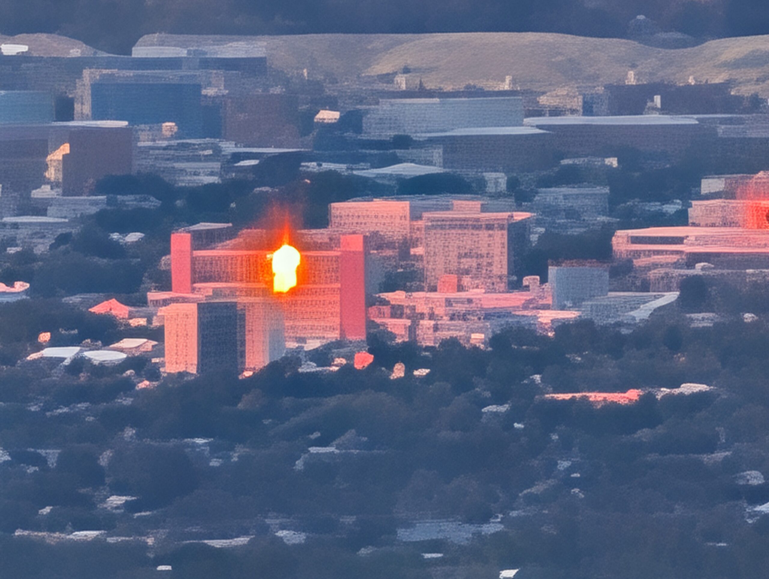
An AI-enhanced image of downtown Salt Lake City at 50x zoom as seen from Kearns High School on Saturday, June 27, 2026.

I was excited to unbox the Pixel 10 Pro last week, especially as the defective screen on my Pixel 7 was detaching for the third time. I was eager to try out the new-to-me triple camera setup, which I think lived up to expectations based on some of the photos I took Saturday at the Eccles 2002 Olympic Winter Games Museum at the Utah Olympic Park in Park City.

I shot these photos through glass-covered display cases, which can reflect some pretty nasty glare. I thought I was using the 5x telephoto lens but it appears I was using the main lens. However, the main camera allowed me to get close to the medals, pins and other objects while allowing me to find angles to downplay the glare.

On my old phone, I used the heck out of the 2x zoom feature (which simply cropped in on a 1x photo without any further digital manipulation). I’m looking forward to getting tighter action shots with the 5x telephoto lens.

I’m not likely to use another feature that Google touted for the new Pixel 10 Pro — the Pro Zoom feature, which promises photos up to 100x zoom. This feature supposedly works because Google sends the raw image through its AI to extrapolate and enhance the image.

My initial finding is that this feature is half-baked and more likely to replace a blurry, grainy image with a simulated nightmare reminiscent of computer-generated images from at least a decade ago. Even worse, the feature tries to substitute imagery that the algorithm supposes is there, but it introduces fake and misleading information. For example, when I tested the feature at Best Buy, the Pro Zoom feature was able to sharpen a brand name on a distant box, but introduced literal Greeking in place of smaller text it couldn’t fully scan.

Coming back from curling on Saturday, I was drawn into the parking lot of Kearns High School with its view of the Salt Lake Valley from the west. I wanted to see how much the Pixel 10 Pro’s cameras could push into downtown Salt Lake City over 10 miles away.

I started with the wideangle lens and the 1x zoom on the main camera, but they don’t show too much detail of the distant urban core. I saw better results with the 2x zoom and the telephoto lens at 5x.

Even at 2x zoom, downtown looked too distant. The 5x lens definitely added a lot of detail and might be usable with some additional cropping.

Things got dicier when I pushed the digital zoom on the 5x lens and Google added what should be AI magic. The image at the beginning of this post is at about 50x. It’s a little blurry with some computer artifacts, but most landmarks are still recognizable. It does appear that Google’s AI replaced part of the rotunda dome atop the Capitol with the foothills behind it.

I kept pushing in, up to 100x, as I tried to make out the Salt Lake Temple in the heart of downtown.

For reference, this is a photo from The Church of Jesus Christ of Latter-day Saints showing what the temple looks like.

Google took the raw image, ran it through AI and came up with … something not even close to the Salt Lake Temple —

An AI-enhanced image of downtown Salt Lake City purportedly at 100x zoom taken from Kearns High School on Saturday, June 27, 2026. The spires are supposed to be the Salt Lake Temple, but it doesn't match the building's true appearance.
An AI-enhanced image of downtown Salt Lake City purportedly at 100x zoom taken from Kearns High School on Saturday, June 27, 2026. The spires are supposed to be the Salt Lake Temple, but it doesn’t match the building’s true appearance.

This is a mess and epitomizes the phrase “AI slop.” The spires in the center of the image look more like poorly rendered Buddhist temples from Asia. The overall effect of the zoomed-in image feels like image textures applied to 3D objects in older computer games, like SimCity 4.

I also tried to zoom in on what I thought was Rice-Eccles Stadium at the University of Utah. The result did _not_ look like a stadium, but rather some low-slung buildings took the place of stadium seats behind the building’s main facade. To be fair, the angle from Kearns made it a little tricky make out the stands.

I’ve been ambivalent about digital zoom on cameras and phones for years as it can’t add information beyond what the camera sensor captures. Over the years, companies like Google have used computational computing to enhance images (although part of this tech often merges multiple, slightly different versions of an image to come up with an ideal overall photo).

While mere digital zoom can’t add info, Google and other companies are attempting to use AI to filling in missing details but the initial results leave much to be desired.

Every time there is a major technological advance, there is often a debate on how to maintain journalistic ethics. For example, how much can one use Photoshop on an image while maintaining its authenticity? Some image toning is generally OK, but cutting out a subject and placing it over another background would be a no-no unless it clearly looks like an illustration and is clearly labeled.

The ability to use what we call AI to spin images and videos out of whole cloth has sparked new debates. However, I don’t see a debate for now with Pro Zoom or similar tech — these poorly generated images bear little semblance to reality and should not be used in news reporting or at all.

That might change with future advances, but Pro Zoom doesn’t appear to be anywhere close to being usable for now.

GEL-ing with the Google Experience Launcher on a Galaxy S II

Out with the old… The old TouchWiz launcher from my Galaxy SII.
Out with the old… The old TouchWiz launcher from my Galaxy S II.

I’ve been excited to try out a new home screen, or launcher, for my Samsung Galaxy S II (Epic 3G Touch).

Since April, I’ve been using the default TouchWiz launcher that came with the S II. However, I’ve recently been intrigued to try the new launcher from Google — apparently called the Google Experience Launcher or Google Home.

Unfortunately, it didn’t seem like I was going to be able to try it out — the new launcher was part of the latest version of Android dubbed KitKat — and Samsung wasn’t planning to publish an update to my now two-year-old phone. Even if it did, there was no guarantee it would be made available on the Sprint network.

I was pleased to discover via Android Police that the tools available to enable the new launcher would work on my phone — or any phone or tablet running Android 4.1+. I needed the latest version of Google Search and the Launcher app (provided on the Android Police website). After a quick install, I was off to the races. I thankfully didn’t need to root my device or sideload from another device because they seem like too much of a hassle.

In with the new with the Google Experience Launcher, a.k.a. Google Home. A screenshot of the new launcher on my Galaxy SII.
… and in with the new with the Google Experience Launcher, a.k.a. Google Home. A screenshot of the new launcher on my Galaxy S II.

At first, the differences in the home screens are pretty subtle. It appears to run very smoothly on my S II and seems very responsive in most actions. There’s one exception — the screen seemed to jarringly jump around when dragging icons from the list of applications to create new shortcuts on the home screens.

On a positive note, it’s a bit fun that the wallpaper seems to stretch across multiple pages. The swan and the Palace of Fine Arts subtly shift as you swipe from page to page.

One of the biggest changes is that the Google search bar is now on _every_ page of the home interface (in TouchWiz, the Google bar was a widget that the user could choose to put on their phone).

Although the search bar is always there, Google did a nice job of tweaking icon sizes and layout to maximize space and it turned out I could have more apps or widgets on my primary home screen (the old widget took up four icon positions in a row).

This ever-present search bar probably won’t endear itself to those critical of Google’s increasing intrusion into people’s lives (and privacy). It’s important to note the new launcher is apparently an extension of the Google Search app, as reported by Ars Technica. Basically, the app _is_ the new home screen for phones that choose to use it.

I understand the reservations about Google blatantly taking over a user’s home screen compared with it lurking in the background. Thankfully, one can still switch between launchers, although I’ve temporarily settled on Google’s as the default for now.

Touching the Google search bar merely opens an expanded and simple search page. This is different than Google Now or the old Search app interface. I feel it would be more convenient to switch into Google Now, but that doesn’t seem to be in the cards for now.

Speaking of Google Now, it’s now accessible by swiping all the way from left to right.

I think one of the most useful changes is the ability to launch a voice search from the home screen by saying “OK Google.” Apparently, the new Moto X (and Droids) can do this while the screen is off, but it’s still useful.

Other things I noted is that not all widgets seem to work with this new Google home. The notification tags also weren’t showing up. My old Accuweather widget wasn’t available and I couldn’t view the widgets from the Yahoo! Weather app. I hope that this will be fixed (or is perhaps a shortcoming of how the app works on my phone).

Perhaps another sign of this launcher’s roots in the Google Search app is that the settings menu goes to the app’s settings and not the phone’s. I was used to the settings menu accessing the phone’s configuration and this more limited functionality was a bit of let down. I created a shortcut, but it’s not quite the same.

Also, the icons and text seem a tad too small for my eyes, but they don’t seem that much smaller compared with TouchWiz. It may be due to the apparently tighter layout because it looks more like a solid wall of icons unless I use a widget to break up the space (I have six more apps on my primary screen under Google Home than TouchWiz).

The differences between this and TouchWiz seem to be pretty subtle, but it’s nice to try something new. That is something that isn’t easily accomplished on iOS, where you’re generally stuck with whatever Apple gives you. Still, we’re talking about different, yet incredibly similar ways to display rows of icons and some widgets on a smartphone. I’m pretty happy with all three offerings.

Ultimately,  I’m happy I can give the Google Experience Launcher a shot. I can spruce up my old phone although I can’t have the full KitKat experience (at least until I can get the Nexus 5).