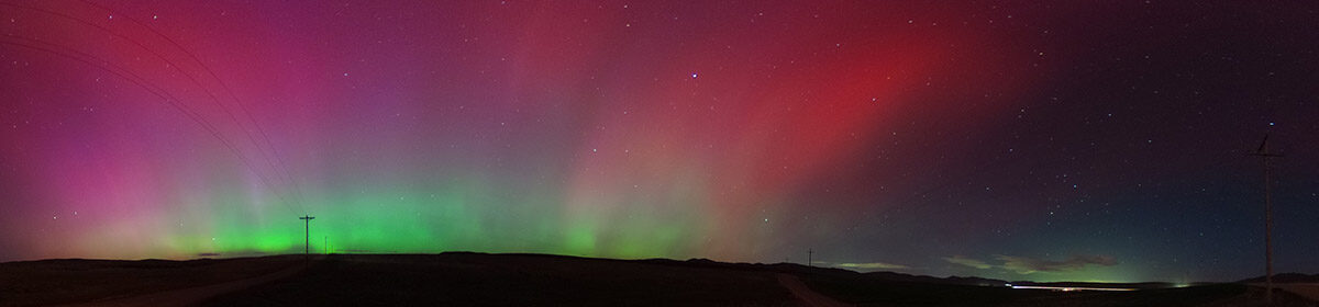
As seen on Instagram, I debuted a new yellow UCSD T-shirt on Friday, Feb. 17, 2017, as the UC San Diego Tritons took on the Brigham Young University Cougars in Provo.
I’ve been a pretty vocal opponent to the possibility of UC San Diego moving to Division I. Despite my past reservations about D-I (which seems highly likely at this point), it was a total blast to once more cheer on the UCSD Tritons in men’s volleyball tonight against Brigham Young University.
This was a match I had been looking forward to ever since I moved to Provo last May — men’s volleyball is the only Triton team that regularly competes against a team in Utah. When I was in Chico, UCSD and Chico State were in the same conference, so there were always a couple of opportunities every year to cheer for the blue and gold in sports like basketball, baseball, softball and women’s volleyball.
Although I hoped to be loudly cheering for the Tritons on Friday, I knew that there would be a lot more people rooting for the Cougars. Watching some past volleyball matches on BYUtv, I knew that the Smith Fieldhouse can be a loud atmosphere but I wanted UCSD to have a voice there as well. I also bought a new, bright yellow Triton T-shirt for the occasion. All of my previous shirts were shades of blue, which would probably blend in with the Cougar blue that was sure to fill the stands.
When it came to buying the tickets earlier this week, I was a bit at a loss — I didn’t know if there would be any Triton supporters in attendance and where they might sit (and the reserved seats weren’t necessarily cheap). The box office staff at the Marriott Center was friendly, but they didn’t know either. Eventually, I just settled for the $5 general admission ticket and decided to take my chances.
On game day, I donned my new shirt and made my way north to the BYU campus. Parking was super-easy as the expansive fieldhouse lot is available to the public after 4 p.m. or so.
The fieldhouse itself was a quirky older building, with a narrow indoor track ringing the court and seating area. I made my way past the clearly reserved seats to the opposite side of the court. I asked a man handing out programs if this where the general admission seats were. He said yes and commented that I was brave wearing that shirt inside the fieldhouse.
As I made my way into the arena, I saw blue, plastic hard-backed bucket seats. The aisle seats were all marked “reserved,” and I assumed that only _those_ seats were reserved. That was an erroneous assumption, but I wouldn’t find out about that until later.
I found a great seat about five or six rows up near center court (but not on the center line because it had the “reserved” sign on it). I picked the side that I knew the Tritons would be on and settled in. I noted that the playing area on the court was smaller than it looks on TV. I’ve attended dozens of volleyball games, so I’m used to the court dimensions but the difference in perspective was fascinating.
It was about 30 minutes before the start of the match, so I took a self-portrait to post online. I also dashed to the concessions stand for a couple of waters because I knew it was unlikely that I would be able to leave my seat once the match began (a prediction that generally proved correct). The crowd slowly trickled in. I looked about several times to see if there were any other Triton fans in attendance, but I wasn’t having much luck.
All too quickly, the countdown clock wound down and it was time for the match to begin. After singing “The Star-Spangled Banner” along with the crowd over a very loud recorded instrumental version of the song, it was game time.
Writing in a journal at the Chipotle on Mangrove Avenue in Chico.
I’m trying something new on my blogs. For years, I haven’t done a great job of keeping things up to date, letting months go by between updates. It’s not that I haven’t had anything to say. I have had plenty of things to write about — and now’s the time to write about them.
Starting today, I’m launching a daily item called The20. Every day, I want to set aside 20 minutes to write anything on any topic that catches my fancy. It could be a review of a TV show or move that I’ve seen recently, it could be some thoughts on the weather outside, recapping some recent adventures or taking a deep dive back into some events that I would enjoy recounting. To maintain impartiality and professionalism, I’ll stay away from politics.
As you can tell, the topics will be pretty random, but I hope it will be enjoyable. I know it will be for me (and I seem to be the primary reader on these sites). A while ago, I re-read some old blog posts I wrote about karaoke when I first moved to Chico in 2005. They’re nothing earth-shattering and they didn’t follow the time limits I’m proposing for this column, but it was interesting to review my brief chronicles of an activity that I still have a lot of fun doing.
That’s the other component of The20 — it will contain everything I write in 20 minutes. It will be interesting to get a sense of how much I can write within the time limit. I may break some topics or subjects into multiple part essays to help bridge them over multiple days. There are journeys that I’ve taken or moments in my life that I don’t think can fit into a single, 20-minute chunk.
While I’m worried that I won’t be able to get everything out in 20 minutes, the opposite may be true. After 15 minutes today, I’m finding that I’ve written most of what I want to say on this subject and I’m largely just editing my post at this point.
None of these are going to be hard and fast rules — I’ll probably do some editing and adding photos after time is called. There will also be some topics where I will go long (Monday’s essay on Lake Oroville is an example).
I’m excited about this new project. Everyday, I spend so much time away from work just randomly reading websites or watching TV. I eventually reach a point where I feel I’ve read or seen everything I care to for a day. It will be nice to focus some of this energy on actually creating something.
There are a lot of things I’d like to share with others, but I need a plan. Although I can be slow to pick up the pen or start typing, I can get totally engrossed in the process.
A view of the Oroville Dam emergency spillway from the Spillway boat launch in March 2016. In February 2017, much of the area was underwater as the emergency spillway was used for the first time in the dam’s 48-year history.
My thoughts are with everyone who has been affected by the crisis at Oroville Dam, which led to the evacuation of around 200,000 people living downstream Sunday out of fear of a collapse of the emergency spillway.
In less than a week, the 48-year-old structure has been faced with the double whammy of the deterioration of its primary concrete spillway and potentially devastating erosion of a concrete weir which doubles as an uncontrolled emergency spillway. It was the first problem that led to the second problem, culminating in Sunday’s emergency. (That said, the primary dam itself is OK, despite misleading news headlines to the contrary.)
I can’t fault Butte County Sheriff Kory Honea for his decision to call for the evacuation Sunday. I don’t have all the facts, but it sounded like things were on the verge of disaster and calling for residents to leave the area seems like a sensible precaution when lives are at stake. The region has had devasating floods in the past, which led to the construction of the dam complex in the first place (that and suppling water to downstate users).
While there should be some hard looks at the decisions that helped lead to this crisis, it’s unfortunate that a full Lake Oroville has turned into calamity. It’s the exact opposite of just three years ago when a half-full lake was used as the representation of California’s prolonged drought.
It wasn’t a pretty picture at the lake three years ago, which ironically made it a tempting image for photographers and TV news reports. At the drought’s low point (pun intended), all but one of the lake’s boat ramps were out of water and marinas had to remove houseboats because of the dwindling lake surface area. The lake looked like a giant, half-filled bathtub with the exposed shoreline looking like a red-colored ring.
I remember last spring, when a good water year helped fill the dam to near capacity. I stood on the trail overlooking the spillway as water flowed down it for the first time in years.
People I spoke with then were so elated to see the spillway open and the prospect of the lake filling to capacity (it didn’t in 2016, but it came close). I was personally awestruck when I calculated how much water was flowing down the channel, even though it looked so abstract at a distance.
That picture’s totally different today. The force of water took on a new, fear-raising aspect last week as we contemplated pictures and video of the concrete spillway being critically damaged.
As the lake reached new heights, concerns did too as the lake hit the emergency spillway level of 601 feet above sea level for the first time ever over the weekend.
Less than 36 hours after Oroville crossed that threshold, evacuation alarms were sounded as there were concerns that erosion could compromise the emergency spillway (I’m curious about when people started calling it an “auxiliary spillway,” because I’ve always seen it referred to the other way.)
Considering the damage that’s been done to the concrete spillway, I think it’s understandable that something catastrophic could happen to the emergency one. I don’t know how much water would be released in that situation — it wouldn’t be as much as a dam failure, but it would still be pretty bad. Even a two-foot elevation change could suddenly release about 10 billion gallons of water in the downstream Feather River.
As of last night, the state Department of Water Resources was working to lower the lake by about 50 feet. As the lake lowers about a foot every three hours, it will hopefully reach the 850-foot threshold before a new storm hits the area in a few days.
Still, I wonder if that’s enough. The DWR’s ability to remove water has been critically compromised by the problems with the two spillways. Even as the pressure on the emergency spillway is reduced with the lowering lake level, I don’t know if officials and the public should count on it until some serious inspections and repairs are made.
I think officials should keep lake water pressure off the emergency spillway structure AND maintain enough flood control buffer space (which one document I saw stated was 750,000 acre-feet, although I think that figure actually varies based on the time of year).
To accomplish both, I think the lake level should be lowered even futher — to about 788 feet above sea level. That’s based on the current drawdown to 850 feet, plus the 750,000 acre-feet of flood control buffer.
Such a move would leave the lake about 58.2 percent full (with 2.06 million acre-feet of water stored), at least until the end of the season when the flood control isn’t needed anymore.
It’s unfortunate that we should have to lower the lake level after years of wishing for a full lake. However, this recent storm showed the inadequacy of the current, impaired control system.
Lake Oroville has already seen two periods this year where water levels surged dramatically. If we want local residents to be safe in their homes in the event of a third surge, the lake level should be dropped to a threshold that offers the most safety without risking further damage to the emergency spillway.
After shooting around Chico for my first five cards, I went all out for the 2013 Christmas card and ended up with what is probably the most beautiful of the cards that I’ve shot so far.
I always had a number of reservations about the Sierra Nevada Santa, including the fact that I don’t want to encourage drinking and sleighing. I also didn’t necessarily want to go to the expense and effort of renting a Santa costume, especially because I had doubts that I could pull off a convincing Santa.
After some consideration, I thought that I could build a snowman wearing a Sierra Nevada shirt. I always strive for a PG-rated card and the shirt in of itself is fairly innocuous. I would also need to go to a location where there was snow and my first thought was of Lake Tahoe.
I’d never been to Lake Tahoe before and I was excited to check it out while shooting my card. Although I’ve always maintained that one of my goals was to create Chico-oriented cards, I made an exception because it doesn’t really snow in Chico and that I was remaining in Northern California.
As time passed, I worried about being able to get to the picturesque lake in time. After hearing of snow in foothills and Sierra Nevada, I decided to try a location closer to home up Feather River Canyon on Dec. 8.
It was a total bust. After driving up Highway 70 along the winding Feather River, I made it to Quincy. My hopes were buoyed by the fact that the snow cover increased as I headed further uphill. I sought an open field to build the snowman and picked Feather River College just outside of town.
Attempting to build a snowman in Quincy
It … didn’t go well:
The snow didn’t clump very well and it was impossible to build a firm enough snowball to form the nucleus of the snowman.
After a few minutes of trying, I gave up and retreated down the hill back to Chico frustrated but happy that I had enough time to pursue alternatives.
The alternative came up quickly. I realized I could use my California Rail Pass that I would buy to travel to San Diego for the transportation to South Lake Tahoe. The Rail Pass was a great value — for $159, a passenger can travel to destinations within California on any seven days during a 21-day period (with several conditions). Although Amtrak doesn’t have a train that goes to Lake Tahoe, it has a motorcoach that makes the connection from Sacramento.
Leaving Davis Station in December 2013.
On Dec. 14, I made the trip to South Lake Tahoe via Davis and Sacramento. I was bundled for the cold, but it was a gorgeous sunny day. I primarily slept on the bus as it traveled on Highway 50, which was probably for the best because it is a very windy road up to Tahoe.
When I arrived in South Lake Tahoe, I was a little bummed out that the buildings were a little dowdy. I had pictured either a quaint downtown with classic old buildings or picturesque mountain village. What I saw was neither — much of the construction was simple, modern boxy construction.
Adjusting my expectations appropriately, I consulted with a map at the visitor’s center to look for an open field that would help provide an appropriate view of the mountains that ring the lake. Seeing a place that I could work, I walked a short distance to Rabe Meadow.
The meadow was perfect. There were houses nearby, but the meadow presented an open field with near-pristine snow with either stands of trees or the mountains themselves as possible backgrounds.
The snowman as I was about to leave Rabe Meadow
After picking an ideal spot, I set to build the snowman. It went far easier than before and I was able to quickly build the three spheres that would comprise my model. When it came time to put the Celebration Ale shirt over the snowman, I quickly realized that its torso was too big.
Because I was working with snow, I used my gloved hands to hack away at the snowman’s torso until it was just broad enough for the shirt to fit comfortably. As some of the photos show, the lower part of the snowman is disproportional to the rest of the snowman but I generally refrained from photographing the snowman’s whole body.
After putting on the T-shirt, I wrapped a scarf around the snowman to add further character to the creature. For his face, I used a handful of stones that I’d gathered outside my apartment in Chico. Once he was decorated, I think he resembled an Ewok or perhaps a stuffed teddy bear I had as a child.
A close-up of the Sierra Nevada snowman
Getting everything set up went fairly quickly and I was able to take dozens of photos of the snowman from different angles and distances. It was tricky because I wanted to adequately capture the background in addition to featuring the snowman prominently while showing the Sierra Nevada T-shirt.
It was a positive that I could rotate the snowman to capture different backgrounds. I tried to shoot pictures with the mountains stretching across the horizon and others with a stand of trees extending into the background.
Complicating things was trying to capture the scene without having odd objects in the background intruding on the snowman at weird angles. It was also warmer than I had expected and the snow was melting. That ordinarily wouldn’t be too big of a problem, but the water was starting to soak the T-shirt which showed up on a few shots and the rock eyes began to fall from the snowman’s face. (It turned out that it was best that I shot photos on that day because there was no additional snow that month amid the ongoing drought).
Generally, the photography went well with terrific early winter sunlight. A passerby was nice enough to take a photo of me with my creation.
The Sierra Nevada Snowman and me.
After finishing the shoot, I was able to enjoy walking around South Lake Tahoe. I had booked a room overnight, so I had plenty of time to walk out to the beach and then head back toward town for some food, libations and entertainment before calling it a night. It was definitely a great trip and I felt that I had a great card on my hands.
When I returned to Chico, I had the challenge of finding the right photo and creating the best possible card. I went through the dozens of photos and picked the two or three that I felt best captured the moment. I generally liked a photo where the snowman was in front of the mountains with the blue sky in the background. However, I ultimately preferred a picture with the snowman in front of the stand of trees because I like how the evergreens contrasted with the white snow and red T-shirt.
Once I picked the photos, it was a matter of picking the right card template. I generally didn’t like the Costco templates because I felt they failed to showcase the actual photo prominently enough. This year, I looked at the Apple iPhotos card templates and found a couple of viable options. I also tried different messages including “A Celebration for All Occasions.”
Thumbnails of possible 2013 cards.
I definitely liked the iPhoto designs better than the Costco ones, but it was tricky to adapt a template set for one perspective to Costco’s 6 inches by 7.5 inches. I also wanted to feature as much of the photo as possible and the iPhoto templates generally didn’t do that … except for one.
I ultimately went with a simple green banner across the bottom featuring the message “May Every Occasion Call For Celebration.” It was easiest to adapt for the Costco print sizes and definitely put the picture front and center.
The 2013 Christmas Card — “May Every Occasion Call For Celebration.”
Ultimately, this was one of the most fun Christmas cards to make. It’s probably the best and most beautiful card I’ve created too, although I would definitely try to keep the standard high in the years to come.
By the numbers:
278 — miles traveled for the 2013 card (83 miles to Quincy for the initial failed attempt and 195 miles via bus to South Lake Tahoe).
11 — Days before Christmas when I did principal photography.
127 — Principal photos for the card (out of 211 pictures shot during my two trips).
I’ve gone into my 2012 card before. This was probably the hardest year for me to come up with a concept and the execution isn’t the best — especially because it’s so hard to see what the image is supposed to be.
This year marked another departure from my core concept of the Christmas card. Instead of featuring either Chico, Northern California or myself, the card features a conceptual snow angel rendered as confetti on the floor of my workplace at the ChicoER.
I appreciated the help from my friend Evan, but overall this card could’ve used a bit more polish. Unfortunately, this card was photographed on Dec. 21 — one of the latest cards I’ve shot. I remember trying to get the cards printed in San Diego, but they would’ve taken too long to print. As it was, they went out after Christmas.
I again used a Costco template and so I only have a picture of the card to go off of. The inscription was a bit more poetic than usual —
Although there’s no snow, you can make a snow angel in a hot town like Chico!
On a positive note, this was the first Christmas card shot with my sister’s Canon PowerShot camera. It has better resolution and a more powerful optical zoom than the old Sony I was using (and the screen still worked, which was something I couldn’t say for the Sony at the end).
In any case, there’s more to the story here (including my original inspiration from a live-band karaoke show in Oroville).
By the numbers:
4 — Days before Christmas when I shot the primary photos.
5.3 — Miles traveled to shoot the card (at work). Also, these mileage totals are one-way — I don’t want to inflate my numbers.
18 — Photos taken for the 2012 card (that number’s about to get _a lot_ bigger for the 2013 card).
I’ve previously written about my 2011 card when it first came out. After taking a couple of years off from being wholly focused on Chico or Northern California, the 2011 card was based on an inside joke with a friend during a long-ago karaoke night.
Although my friend had moved on to greener pastures when it came time to shoot this card, thankfully Autofry was still around (although it too has since moved on to whatever counts for greener pastures among industrial food machinery).
Despite my griping, I ended up using one of Costco’s templates for the card design. I generally think it worked out OK, although I’m bummed that there’s no high-res version of the card that could be saved electronically for my records (although I suppose I could scan a print digitally).
Autofry and I hope you ‘ring’ in a merry 2012.
The 2011 card is unique because my friend Marcus only shot one photo on his cellphone. Compared with other years, I only had one option with this card. Thankfully, it worked out.
Again, I’ve written more about the 2011 card here.
By the numbers:
1 — Number of pictures taken for the card.
1.6 — Miles traveled to The Maltese for principal photography.
8 — Onion rings visible in the photo (they were delicious).
OK. I missed a couple of days because of work and because … I was mailing this year’s card to friends and family. Thankfully, I’ve already written about two of the three days so it should be fairly easy to catch up.
I haven’t yet written about my 2010 card, which was the first year that I almost didn’t do a card. In December, I was still recovering from two medical scares from the summer and fall. I recall not having a lot of enthusiasm for the project, especially if it entailed physically making the cards as in the first two years. Despite this and other challenges, the 2010 card turned out to be one of the more whimsical designs that I’ve created.
I definitely sought about creating a playful card. My first concept of depicting me placing the star atop the Christmas tree didn’t come together because the images didn’t look great. The best pic of that shoot on Dec. 14 came out too dark:
This was the best pic from my initial effort for the 2010 Christmas card.
So, I went back to the drawing board for another concept. Thankfully, it came together fairly quickly once I had the idea of “popping” into the card from an unexpected angle and located the needed headgear (from Wal-Mart). As I pondered how unbreakable the unshatterable ornaments were, I bought a pair of wearable reindeer antlers with a mini Santa hat.
I tried a couple of different places to shoot the primary image, including Woodstock’s Pizza. The images were just OK, but it did produce this fun, if a bit blurry, “Christmas buddy cop” pic with my friend Heather.
The Christmas buddy cop pose
Eventually, I think I went back to my apartment to shoot the main pic with the Cybershot. My primary concern is that I wasn’t happy with my hair. Given my medical issue, my hair decided to go on a temporary vacation. At the time, I was worried that it was a symptom of a far larger problem, but thankfully the hair grew back (for now).
The 2010 card
The primary pic turned out pretty dark, but Photoshop was able to salvage something usable over the neutral background of the hall last seen in the 2009 card. If you look closely, my ability to “cut out” the ball on top of the cap was pretty limited. I hopefully know how to fix that now.
When it came time to finishing the card, I think I used the text tool in Photoshop to add the seasonal message. I’ve looked at the card templates at places like Costco and online with iPhotos/Photos. Although I’ve ended up using templates over the years, I generally don’t like how they leave a limited amount of space for the photos. At the same time, the photo cards I received from other friends and family looked presentable and perhaps a little more professional than my earlier, artisan efforts.
This was the first year that I used Costco for my cards. I realized in 2009 that Costco was fairly economical for their standard-sized photo cards to the point that it was cheaper than my printing out the photos separately and pasting them on cardstock. It also saved a lot of time — I could have 50 cards and envelopes ready in a day when I would take me considerably longer to make the cards myself. The only real downside is paying for the annual membership, but I’m fairly strategic on when I renew so I only have membership when I really need it (every December).
Despite the difficulties, the 2010 card got out of the door (although they were probably late). I liked the main image so much that I usually use it as my avatar online at least once or twice whenever I’m feeling in the holiday spirit.
By the numbers:
1.94 — miles traveled for the card (although I ended up using pictures shot in my apartment.
3 — days before Christmas when I shot the primary photo for my card.
Continuing with my look back on nine years of Christmas cards, 2009 marks the second year and the final year of doing entirely homemade cards.
While the card production was simplified from the first year (no elaborate cutting), the main image was a bit more complicated as it featured me twice.
The theme of the card was intended to convey passing the spirit of Christmas on to others. What turned out has been described as “creepy” by a dear friend because of the black gloves in the picture (although the right glove is dark blue even if it didn’t come out that way). That was certainly _not_ my intention, but my hands weren’t photo-ready that year and I needed to improvise.
My previous blog entry on the 2009 card doesn’t go into too much detail, but I used Photoshop so I could play both giver and receiver of the tiny tree. It’s nice that retailers sell trees of all sizes — I decided to use trees sized as lawn ornaments for the card. This was my first deviation from doing holiday cards focused on Chico or Northern California, but time was short that year and I still incorporated a personal touch to the design.
I again used the family Sony Cybershot for photos. I set it up on a tripod in my apartment facing a hallway wall that I thought had sufficient light. I abstained from using the flash, especially because I wanted the Christmas lights to stand out on the tree.
My “noir” look.
Unfortunately, the light in the hallway wasn’t sufficient (at least for my camera and my personal technical ability). I turned on more lights around the hallway (which opened into the kitchen/living room) and arranged a directional light on the “set.” A friend liked the noir look of one of my test shots.
I primarily focused on getting the left side of the card right — making sure the angle and presentation of the tree was correct. As the test shots below indicate, it was difficult to get everything _just_ right (especially when working with a camera timer) but I eventually got a shot I was satisfied with.
I also tried to hide the power cord connecting to the tree’s lights. I was only partially successful, as one can see a power plug hanging from my coat sleeve.
I changed coats and gloves to shoot the right side of the card. I was worried about the shadow that the arm cast against the wall, but I was pretty confident that I could use Photoshop to edit out the shadow.
After getting my shots, I used the computer to compose the primary image. I attempted shot a neutral background as a canvas, but the final product doesn’t particularly reflect that. I remember the image came together pretty quickly as there were only really three elements. That said, doing any sort of cutout of a pine tree is a painful experience (one that I’ve repeated in the 2016 card).
The 2009 Christmas card.
For the last time, I printed out the image as prints at a local store. I switched up the white cardstock for red for a little more visual pop.
I also used a printer for my message “Spreading a little holiday cheer… and wishing you a Happy New Year.” Although it was a bit tricky to align everything correctly, I liked the clarity of the printed text although I missed the personal touch of the handwritten cursive of the previous year.
I used a glue stick to attach the photo to the card. It was time consuming and I strove to make sure the image was centered correctly.
I earlier wrote that I eliminated folded cards after 2008. My memory may be hazy — I seem to recall a fold in the 2009 card because I wrote on the inside of the card. However, I think the fact that I didn’t have a great message for the card’s interior was a key reason for moving away from folded cards.
The other reason for moving away from folded cards also included the realization of the relative economy of photo cards purchased from a warehouse store, but that’s a story for the 2010 card.
By the numbers:
0 — miles traveled to photograph the card (this was the only year so far shot entirely at home, although 2010 comes close).
3 — Trees included in the lawn decoration set.
5 — Days before Christmas when I photographed the card (again, not really enough time to get everything done).
Christmas Time is here and I’m starting my annual effort to spread a little cheer. For the past nine years, I’ve been making my own holiday cards. While I’ve generally tried to follow a theme of Northern Californian elements, sometimes I’ve focused on some aspect of my life or followed whatever fancy suited me that year.
2016 will be a bit different … but mostly the same. I’m back in Utah, so the “local” theme now applies to the Intermountain West instead of Chico. Some other things that are staying the same — I shot on location this year as I did 87 percent of my previous cards AND I’m working to make sure they get to people’s mailboxes before Christmas.
To help encourage me to make my deadline, I’m doing a countdown to look back at the eight previous editions of the card culminating with the online debut of my 2016 card. I’m (unintentionally) timing this to end on Dec. 23, which will hopefully allow enough time for the new cards to arrive in the mail and for me to wrap up this holiday special before St. Nick arrives the following day. Aiding my card quest is the fact that I’ve written about four of the eight past editions of the card (to keep things fresh, I’ll be adding some pictures from years past and add some recollections).
In all the cases, I try to do something new and something fun. Sometimes the cards are planned months in advance while others come together very quickly. Procrastination rarely helps the execution of the cards, but sometimes inspiration drops a good idea on my head like Santa and a bag of presents down a chimney.
I previously wrote about my first card just after it came out and blog posts around the time detailed my creative process in developing my first Chico Christmas card.
The first card was probably one of my most ambitious ones in terms of execution. I loved the giant (functional) wooden yo-yo at the Bird in Hand store in downtown Chico and thought it would make a great sight gag.
In order to pull the gag off, I needed the front of the card to isolate the yo-yo, letting the joke reveal itself when the reader opened the card.
There was a decent amount of stenciling and cutting to get the front of the card properly show the toy. After everything was cut, I needed to glue the photo of the yo-yo in the exact proper place or the illusion wouldn’t work.
I also chose a heavier white cardstock to help with the presentation (I worried that regular paper was too flimsy). If I recall correctly, the weight became a bit of an issue because the cards were right on the cusp of being too heavy for a single, first-class postage stamp. I remember not wanting to take the risk and bought a little extra postage to make sure everything go to their destination on time.
This first card was a lot of work and cost a decent amount of money (photos, paper, crafting supplies, postage, etc.), but I liked this initial effort. I wasn’t super happy with my handwriting as a key element of the card itself despite the homemade touch of it. Future cards wouldn’t feature handwritten elements (although I still pen a general message to every recipient). This is also the only folding card that I’ve made in the series — the 2009 card was still mostly handmade, but then I discovered the economy and efficiency of photo cards from a certain well-known wholesale retailer.
By the numbers:
0.71 — miles traveled to shoot the card.
5 — number of days before Christmas when I shot the principal photography (obviously not enough time).
13 — photos shot for this card on my family’s Sony Cybershot that I received from my sister. While I’m excited to share photos from upcoming cards, this one’s pictures don’t have a lot of variation to them (aside from trying to find the best angle and camera settings). Here’s a look at the thumbnails:
Here’s a look at the 13 shots I took for my 2008 Christmas card at Bird in Hand in Chico, California.
In just over 24 hours, the grueling 17-month-long election cycle will grind to a merciful halt. Even after weeks and weeks of ceaseless discussions, debates and squabbles, there are still some issues that haven’t been analyzed to death. One of those issues is the ballot selfie.
For those needing an explanation, the ballot selfie is where a voter takes a self-portrait with his or her ballot primarily to show who he or she voted for. In years past, it generally wasn’t an issue because people generally don’t take standalone cameras with them into the voting booth, much less wait for the photos to be developed and then converted into a format that can easily be broadcast to others. It became more of an issue in the past decade as nearly everyone now has a camera on their smartphones and can share anything with the tap of a screen.
States have conflicting laws about whether these self-portraits are permitted. USA Today publshed a breakdown, showing about two-fifths allow them, while two-fifths ban them and the rest is a muddle. For example, California law doesn’t currently allow them (despite a last-minute appeal by the ACLU), but a law overturning the ban will go into effect next year. Conversely, Utah allows selfies.
When I first heard about the issue about two years ago, I was generally opposed to allowing such photos. I theorized that the photos could provide proof in any sort of vote-buying arrangment. Such a thing could undermine the integrity of a secret ballot.
At the same time, that’s merely a theory. At least one federal court has ruled that it’s not a compelling reason to abridge a person’s First Amendment rights to express themselves in this manner. That makes sense — under strict scrutiny, a government needs to be able to show a compelling reason for a narrowly tailored law that abridges a constitutional right (and that the proposed law is the least restrictive means to accomplish this compelling purpose). That said, I’m not a lawyer and I’m not 100 percent certain that strict scrutiny is the standard here.
In any case, my concern about any hypothetical vote buying diminished when I thought about some of the practices around voting. Of note, if a voter incorrectly marks a ballot, I know some states allow the voter to return the mismarked ballot and ask for a clean one.
So, it’s possible for voters to take a photo of a ballot marked one way and then to ask for a clean ballot and cast their votes as originally intended. Given that possibility, it would be a pretty inefficient and unreliable way to manipulate the system. (Note: there may be ways around that, perhaps by checking the ballot receipt.)
Theoretically, someone could take a photo of a blank ballot prior to filling it out and subsequently use Photoshop or a basic redeye tool and virtually mark the ballot as they see fit.
With those potential safeguards, I reached a measure of peace about the ballot selfie. Ideally, people use these photos to show they are engaged in civic participation, something we generally need more of in this nation.
Then again, there’s the old adage: “Better to remain silent and be thought a fool than to speak and to remove all doubt.” We’ve certainly seen a lot of family and friends prove this saying on social media during this election cycle and posting a ballot selfie may only provide additional confirmation.
I’m tempted to take a ballot selfie myself Tuesday, but I would have to obscure my actual choices. It’s professionally unethical for me to disclose who or what I voted for and that suits me just fine (especially after what I mentioned about people proving themselves the fool).
In any case, Tuesday is the big day. If you haven’t already voted, this is your chance to have a say (balanced against others, of course). I’ll see you at the polls.